


Colour drenching sounds like a trend invented for social media, but the idea is older than the name. Choose a colour, then carry it across walls, ceiling, cornice, skirting, doors, window frames and radiators, varying depth and finish rather than hue. Done well, a room reads as one enveloping volume instead of a collection of separately decorated surfaces.
That makes the approach unusually well suited to period properties, where the architecture is already doing plenty of talking. What follows covers how to build the palette, where finish matters most, and what to leave well alone.
What Counts as a Drench
A drench is not one flat colour everywhere. It is a family of tones drawn from a single paint card — or mixed to sit closely together — so the eye registers continuity rather than contrast. In practice it usually covers:
- Walls and ceiling in the same shade, or one or two steps apart, so the line where they meet softens.
- Woodwork — skirting, architraves, doors, window sashes, picture rails and dado rails — in a related tone, often a shade deeper or lighter than the wall.
- Radiators, pipework and ceiling roses painted to match whatever they sit against, so they quietly disappear.
- Built-in joinery: alcove shelving, cupboards, wardrobe doors, chimney-breast cupboards.
- The surfaces everyone forgets: window reveals, the underside of a staircase, the return walls either side of a bay.
Two or three tones is usually plenty. A fourth often tips a scheme from calm into complicated.
Why Period Rooms Take to It
Tall ceilings and grand proportions
Victorian and Edwardian rooms can carry a coloured ceiling. Painting it a mid-tone rather than the default white brings the ceiling visually down, which is a relief in a hallway with three metres of wall and one small window. In a Georgian room with a deep, decorative cornice, keeping cornice, ceiling and walls in one family removes the banding that chops a tall wall into sections and lets the moulding read as shadow and form instead of ornament competing for attention.
Box rooms, cottage ceilings and awkward geometry
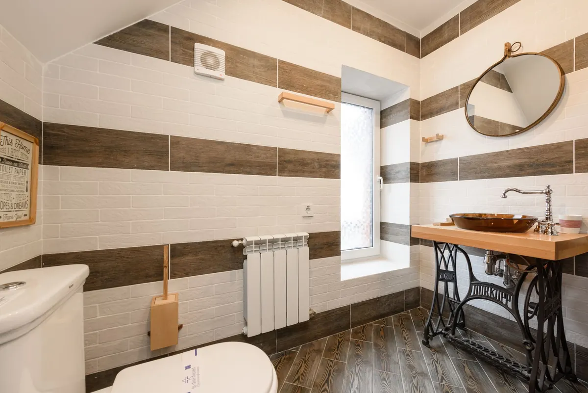
A bedroom with a chimney breast and two shallow recesses, a bathroom squeezed under a sloping ceiling, a low-beamed cottage room — these are the spaces where drenching earns its keep. Corners stop announcing themselves, and the eye stops measuring the room's irregularity. Where a ceiling is genuinely low, keep the whole family pale and the ceiling the same tone as the walls rather than brighter.
Choosing the Tone for the Light
Light direction affects paint more than the paint card does. North-facing rooms receive cool, blue-ish light, so a cool grey or blue can read chilly; warmer versions of the same hue — greige, soft stone, muted olive — hold up better. South and west-facing rooms can absorb deeper and cooler tones without going gloomy, because the light does the lifting.
Test properly. Paint A2-sized sheets of lining paper, two coats, and move them around the room at different times of day: early morning, late afternoon, and under lamps in the evening. Testing directly on the wall over an existing colour skews everything you see. Do not judge a colour from a small patch, and do not judge it on a bright day alone.
Historic houses rarely look their best in strongly saturated modern colours. Earth-derived tones — ochre, terracotta, slate, soft off-black, chalky green, warm grey — sit comfortably with old brick, stone, timber and lime plaster. It is also worth skipping pure brilliant white on ceilings: against old plaster it looks cold, blue and newly wrong.
Sheen, Finish and Old Plaster
Finish does much of the work in a drench. Matt emulsion on walls and ceiling keeps light soft and shadows honest. Eggshell on woodwork gives a faint sheen that catches light along skirting and door panels, separating them subtly without shifting the colour. Kitchens, bathrooms, boot rooms and hallways need something scrubbable — a durable matt or low-sheen finish will survive hands, splashes and a mop far better than a flat emulsion.
Where walls are lime plaster, or the house has a history of damp, use a breathable paint — mineral, clay or similar — rather than a sealing vinyl or acrylic. Solid old walls manage moisture through their surfaces, and trapping it behind a plastic film causes problems elsewhere. If there is existing damp or crumbling plaster, deal with the cause before decorating.
If the property is listed, changing external paint colours or altering historic joinery normally needs consent. Interior decorating usually does not, but check with the local conservation officer if you are unsure.
Where to Let the Drench Break
Every drench needs one or two places to stop, otherwise a room can feel sealed shut. The floor is the natural break: stone flags, scrubbed boards, quarry tiles or a wool carpet in a contrasting tone grounds the scheme and stops it floating. Furniture, artwork and lighting can be as bold as you like, because a quiet background will hold them.
Then add one deliberate exception — a pale pantry door, an unpainted oak dresser, a white-painted window to match external joinery. One exception reads as a decision. Three read as indecision.
The Order of Work
- Choose the wall colour first. It covers the most area and sets the family.
- Build the family: pick two or three tones from one paint card, or have a single colour tinted lighter and deeper for woodwork and ceiling.
- Prepare properly. Wash woodwork with sugar soap, sand it back, fill cracks, and use the right primer over old gloss or knots.
- Paint the ceiling first, then the walls, then the woodwork last, so any stray brush marks land on surfaces already finished.
- Buy all the tins in one go, or at least check the batch numbers match, so the colour is consistent across surfaces.
- Note every colour and finish in a notebook, wall by wall, before the tins go in the bin. Future touch-ups depend on it.
Before You Pick Up a Brush
Live with your samples for a week, in lamplight and in daylight, before committing. Colour drenching is low-risk — it is only paint, and the preparation you do for it is preparation you would do anyway — but it is high-impact, and the relationship between tones is what makes it work or not. If a scheme feels slightly too heavy once it is up, deepen or lighten the woodwork rather than starting again. Adjusting one tone is far easier than repainting an entire room.
Finally, keep the room's own features in mind. A good drench flatters a fireplace, a sash window or an original cornice by giving it a calm backdrop, not by erasing it. If you find yourself painting over details to make the scheme work, the scheme is doing the wrong job.
Photo: Infinite-Creations / Pixabay
Related posts
More stories you’ll love reading